Hiding in Plain Sight - Part 2
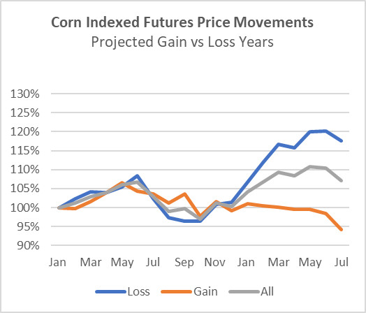
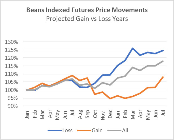
In the preceding article, the primary findings were captured in the two charts below. Price action after harvest and late into the marketing year appears to be influenced by, or at least correlated with, the prior year’s budgeted crop profitability from the planning phases of the prior crop year. When the prior year’s budget shows profitability, then the average price action follows the orange “GAIN” lines shown in the charts below. When the prior year’s budget shows a loss, then the average price action follows the blue “LOSS” line. The difference in the average price action between the two categories of years, GAIN and LOSS, is substantial. If these trends were reliable and repeatable, a farmer’s marketing strategy could be greatly enhanced by biasing the timing of grain sales to take advantage of these historical relationships, particularly as it relates to post-harvest grain marketing.
As mentioned in my prior blog post, my next questions were, 1) Are these differences between Loss and Gain years statistically significant? and, 2) Are the extent of the future price movements correlated with the extent of the projected crop gains or losses from the budget in the prior year?
The chart below shows the scatter plot of the 20 observations that make up the averages on the corn chart above. It shows the spread of these 20 data points, with prior year budgeted profitability on the horizontal axis, and indexed price action from January at the start of the crop year to July at the end of the marketing year on the vertical axis. As anticipated, the correlations are not perfect. Nevertheless, there is a reasonably pronounced downward trend suggesting an inverse correlation between the prior year’s budgeted profitability and the current year’s price action. Poor budgeted crop profitability (or projected losses) in the prior year suggests positive price action will occur over the next crop year. Strong budgeted crop profitability in the prior year suggests negative price action will occur across the next crop/marketing year. Furthermore, the larger the budgeted losses in the prior year the larger the anticipated price outperformance over the course of the following crop year. And by contrast, the larger the budgeted profitability in the prior year, the larger the anticipated price underperformance over the course of the following crop year.
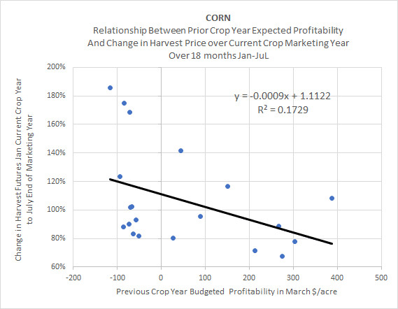
The size of the projected profits and projected losses (shown on the horizontal axis) from the prior year’s budget does help to explain more variance than the simple binary breakdown of GAIN and LOSS years. The R squared of a simple binary split of gain and loss years is 0.1239. The R squared taking into consideration the magnitude of projected profits or losses in the prior year’s budget on the price action current crop year improves the R squared to .1729.
The same general discussion relating to corn also applies to beans. The correlations and predictive value of the model are somewhat less powerful for beans than for corn. Nevertheless, the bean graphs also demonstrate similar overall historical trends and relationships.
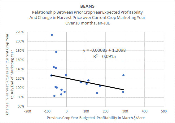
Neither of the corn nor soybean regressions provide a substantial amount of explanatory power or predictive value Nevertheless, there is an apparent correlation that is observed over time which could help a farmer bias or tweak marketing decisions around “frontloading” or “backloading” grain sales in a given crop year to help improve overall grain marketing outcomes.
Comparison to the Usefulness of Seasonality Trends
Based on the foregoing analysis, I thought it might also be instructive to try to compare the relative usefulness of historical trends regarding seasonal variations with the trends described in this article relating to prior year’s budget impact on current year price movements.
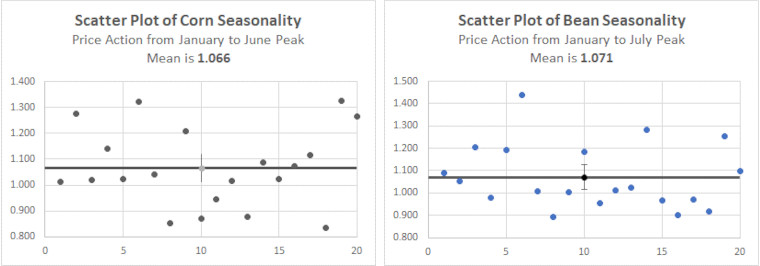
The “tried and true” seasonal variations that industry participants have come to perceive as regular and repeatable trends, are presented in the chart below. Across 20 years of history, the average index value for corn (blue line) increases to a peak of 1.066 in June before reversing course and declining into harvest. The average index value for beans (orange line) increases to a peak of 1.071 in July before similarly commencing a decline to harvest. But how much variation is there around these movements from year to year?

The scatter plots below demonstrate the 20 annual observations for each of corn and beans showing the indexed price movement from January to the June peak for corn or the July peak for beans. It is readily apparent that there are, in fact, substantial year-to-year differences in the price action relative to the mean (the dark horizontal lines in each chart). Therefore, while the odds of a seasonal rally into June for corn and July for beans are supported by the historical averages, these outcomes are by no means assured in any given year.
In conclusion, although commonly used seasonality charts are employed by farmers as useful guides to historical price trends, they are certainly not infallible in any given year. Similarly, the newly observed relationships between a prior year’s budgeted profitability and the current year’s price action (as summarized in this article), will also exhibit considerable variability from year to year. Nevertheless, the use of both of these historical tools can likely be helpful to the farmer in guiding and shaping an overall diversified marketing strategy. If consistently applied over the long term, the use of these tools should help to bias marketing outcomes in favor of the farmer.
More Posts
- Deere Q1 Earnings Boosted 70c by One Time Items (Feb, 25)
- Deere Stock is Vulnerable (Aug, 24)
- Ag Profit Decline and Possible Impact on Deere Shares (Jan, 24)
- Corn and Soybean 2024 Projected Losses (Jan, 24)
- 2024 ARC-CO PLC Decisions Using IFBT (Jan, 24)
- 2024 Cost of Production and Breakeven Harvest Prices (Dec, 23)
- Hiding in Plain Sight (Dec, 23)
- Clearing out the Cobwebs (Nov, 23)
- From Joy to Despair (Nov, 23)